Post number 2 about my A&S champ entry is documenting all the progress pictures and my creative process.
First thing's first. In trying to recreate this piece, I had to get down to business with my least favorite part of the scribal process: arithmetic. For scaling this piece, there was a balance of what would work for the amount of words I had and how large of a piece of parchment I would need. With the assistance of Thyra, we settled on 1.2x scale of the original and have a boat load of notes on how we scaled it. You can see a mix of my handwriting and Thyra's on this. We both apparently have tiny handwriting.
I wanted to remain close to the original layout. In editing down the coronation text, the ceremony for the sovereign and consort line up pretty well leaving the center text space for a "benediction" or in this case the end of the coronation ceremony.
The coolest (in my opinion) and most unique part of the layout is that the margins go all the way to the edge of the paper. There is a 1/4" inch margin on the sides that needed to be cut after calligraphy was completed.


A quick interlude to show off the giant mess that is my workstation. I had a stack of size 6 Mitchel nibs that I went through. Also let's take a moment to talk about that bottle of gold ink. That is a (sadly) discontinued bottle of Dr. Martin's Spectralite 18K gold I used as a substitute for shell gold. It flows like a DREAM.
Once all the calligraphy was done and the center tyger was sketched to my liking...it was time for paint! But first the tyger had a bit of a makeover going on. He got SUPER FLOOFY, then less floofy, then pretty swole, then less so... well...you can see what the changes were on the next few pictures.
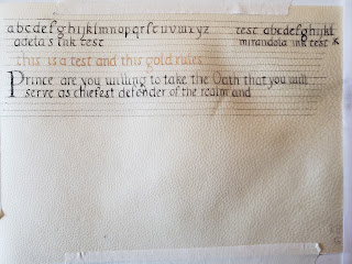
Before moving on to the rest of the colors, I did some text swatches on my piece of practice parchment. There were a few iterations of the red color as I was trying to find a balance between earthy red and well...brown.
Above: take a look at the ink splotch hanging out on the right side. Below: what ink splotch? Turns out scraping/fixing mistakes on parchment is super easy.
Guidelines were erased and the last bit of trimming to the finished size...and.........poof! The entire piece is DONE.
Below is my display for A&S Champs. I'm pretty happy with it. :)


No comments:
Post a Comment